UX
A lot of the concepts may seem simple. But many of them are easy traps to fall into. Some are designs that may look nice on screen but have usibility issues. An interface should always value usability over looks. We are designing interfaces to be used, so usability and readability are always more important than how ‘pretty’ the interface is. That being said, if you follow the guidelines below, you will end up with a clear and simple interface that is both good-looking and very usable. A good explanation of some of the philosophies and techniques described in this guide can be found in this article about “Complexion Reduction”.
Contents
- Typography
- Placeholders
- Spacing
- Hamburger menus
- System paradigms
- User Decisions
- Errors & Loading
- Touch Interfaces
Typography
Uppercase
Do not use ALLCAPS!
Sentence case is always the way to go. We are taught to read in sentences. When we read words, we look more at the shapes of the words than each individual letter. That being said, USING ALL UPPERCASE CAN MAKE THINGS REALLY HARD FOR A USER TO READ. There is no place in UI for uppercase text, it can be “pretty” in design, but the user’s experience is greatly degraded by how difficult ALLCAPS is to read.
If you are making a logo, uppercase can be acceptable because you are making an image / icon - not text meant for reading. Anything that is meant to be read should never use uppercase text. More Info: Wikipedia article about ALLCAPS, succinct explanation relating to UX, longer form, typographical explanation, explanation of how people read.
Line height
Try to keep it at 150% of the font size.
Allow the eyes room to breath. Make sure you apply enough line height that text isn’t squished. 150% of the font size is a good place to start, giving 50% of the fonts height between two lines. More on line height.
Font weight
Not too thin / light.
Don’t use a font that is too thin. It can look nice to use a thin font, but remember the text has to be read with human eyes. No matter how pretty the thinnest font it, consider giving something with a little more weight to be more readible.
Typeface
Use the platform’s native typeface.
Consider using the font native to the device itself. iPhone app? Use the default San Francisco font - even better, support Dynamic Type when possible so your app respects the user’s preferences. Android app? Use the default Roboto font. On the web? Use system fonts. A custom font can be a cool look for logos and other branding, but giving the user a font they are accustomed to improves readibility. People came to your app or site to use it, not to admire how pretty it is.
Alignment
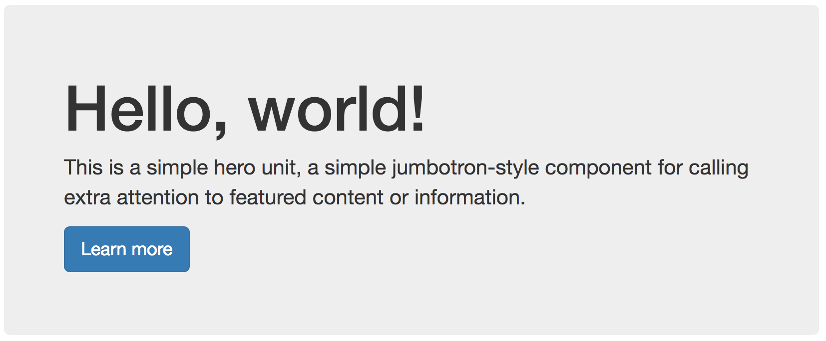
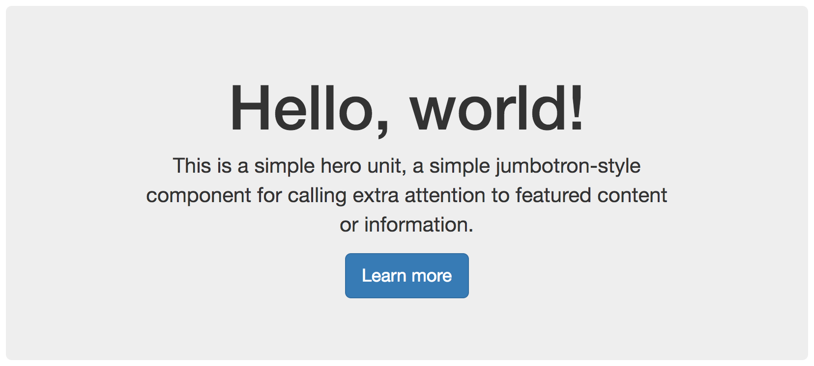
Don’t center align text if it runs longer than one line.
Centered text can be good for buttons, short lines of text, or call outs like headers to add visual symmetry to a page. When text runs longer than one line though it gets hard to read and gets the “Christmas Tree Effect” because it looks like a Christmas tree or text coming out both sides. Prefer to stick to left aligning text for longer more readable text.
| Left aligned | Title and button look ok but paragraph is awkward to read |
|---|---|
 |
 |
Placeholders
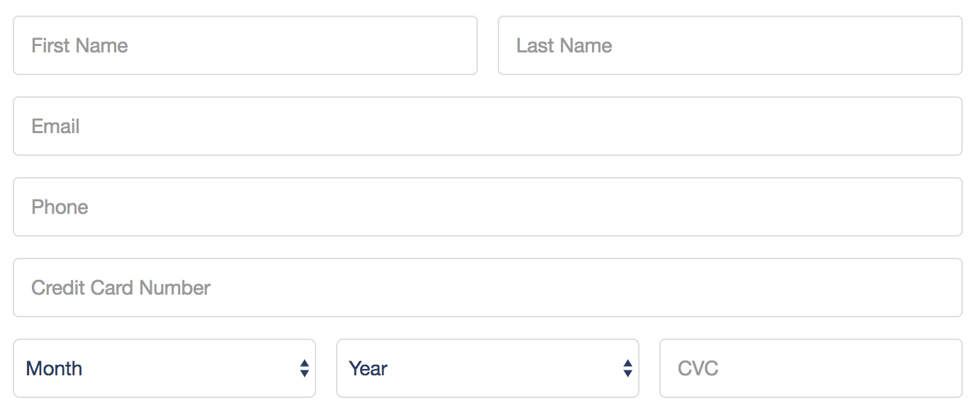
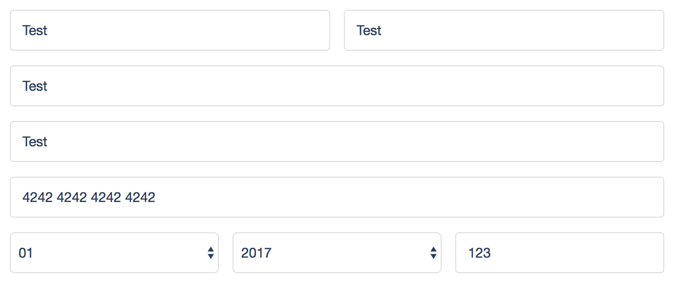
Don’t use them.
Most of the time a label is more appropriate. The biggest issues with placeholders is that they dissapear when you start typing. A label is clear and doesn’t dissapear when you type. Using a placeholder as an example can also lead to confusion by the user whether something is already entered. More on placeholders.
| Bad usage of placeholders | Context disappears when form is completed |
|---|---|
 |
 |
Spacing
Margin / Padding
Keep it equal.
Make all margins / padding equal around every element on the screen. Equal margin / padding will help make the interface more cohesive, look ‘more professional’, and make elements fit together. Equal spacing helps the eyes navigate the content.
Whitespace
You probably need more.
If you aren’t sure if you have enough whitespace, you need more whitespace. Leave plenty of space between elements. Let the eyes breathe. White pixels are free. More on whitespace here.
Hamburger menus
Avoid at all costs!
Hamburger menus can be unavoidable, but should be avoided unless absolutely necessary. Hamburger menus are where features / actions in an interface go to die. On a mobile app? Use a tab bar instead. More on hamburger menus. Funny tweet.
System paradigms
Keep the user comfortable with what they know and use every day.
Use the native paradigms of the device or operating system. If you are building for Android, follow Material Design If you are building for iOS, follow Apple’s Human Interface Guidelines If you are building for the web use native web patterns. For example, use a <select> input instead of using a custom select dropdown. The <select> will be interpreted by the device you are on and displayed to the user appropriately.
User Decisions
Aim for one action per screen.
Help the user succeed by not forcing them to make decisions. Aim for one button / call to action per page, or otherwise try keep the number of user actions on a page as low as possible. Never make the user ask themself “what do I do now?” give a clear course of action for every screen they see.
Errors & Loading (avoiding ‘Awkward UI’)
Clearly communicate app state to the user.
The most important part of any relationship is communication! In the relationship of the user and the app, the app needs to clearly communicate what it’s doing and when things go wrong. Clear communication from the app to the user promotes trust with the product, and by extension, trust between the customer and the brand. Here’s a highly recommended article about avoiding ‘Awkward UI’.
Handle all errors: When an error is encountered (such as a network error, a data validation error, or other unexpected situation, etc) explain to the user what happened in simple, clear, positive, and fun language without getting technical or too wordy (as a general rule, users don’t read, so be as concise as possible!) When appropriate, include an error code or HTTP status code to help customer support (and future you!) in reproducing and debugging the issue. Along with telling the user what went wrong, give a single clear course of action to correct or handle the error.
Show app state: When the app is loading data over the network or performing a long running operation, show a loading indicator so the user knows what is going on. Even better, add descriptive and fun copy to explain what is loading along with the loading indicator.
Touch Interfaces
Make all touch targets at least 75x75pts.
When designing interfaces that are intended to (or might be) used on a device with a touch screen (in 2017 that is nearly any website and definitely any native app), make sure that all ‘touch targets’ are large enough to be comfortably tapped with a finger. An ideal touch target is at least 12mm-15mm, or about 75pts-95pts. Generous whitespace with equal margin / padding around all touch targets will also help to make your interface more touchable. Detailed article on appropriately sizing touch targets here.